Skip to content
  • News & support

Creating & Curating Your Humap Instance

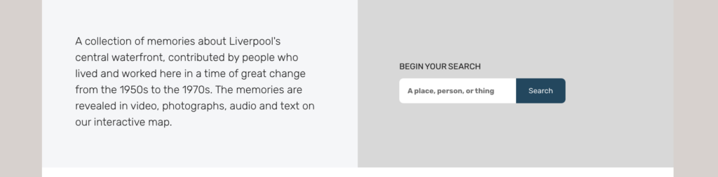
On this page you can find everything you need to get your instance up and running.

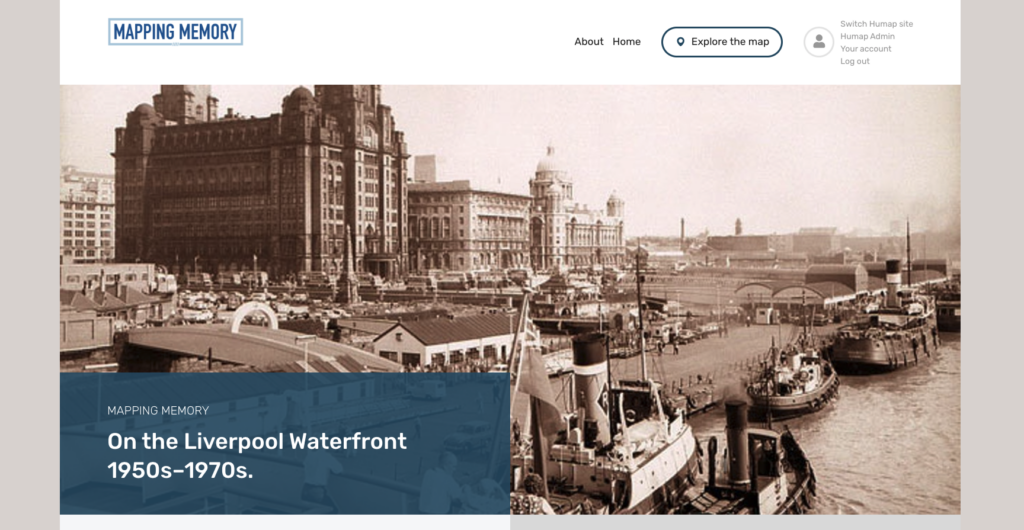
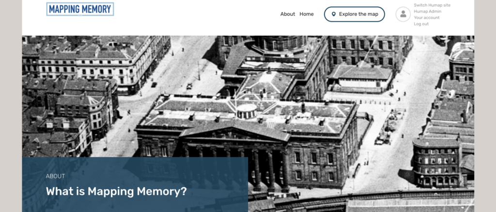
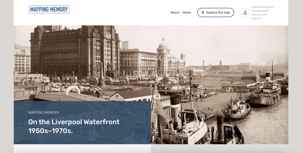
To get to the admin dashboard/content management system, go to the homepage of your instance and click Humap Admin, in the top-right of the screen by Explore the Map button.

If you aren’t already logged in, add /admin to the web address in the address bar. For example, mappingmemory.org/admin.

A screenshot of the homescreen of a Humap instance

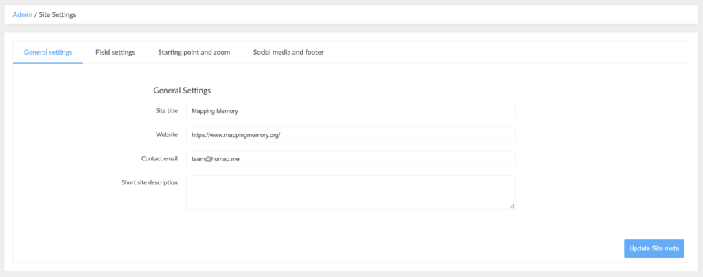
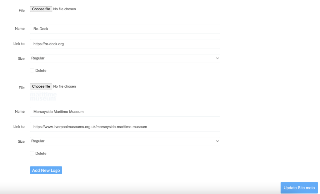
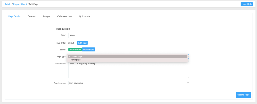
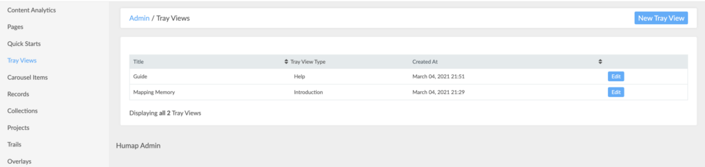
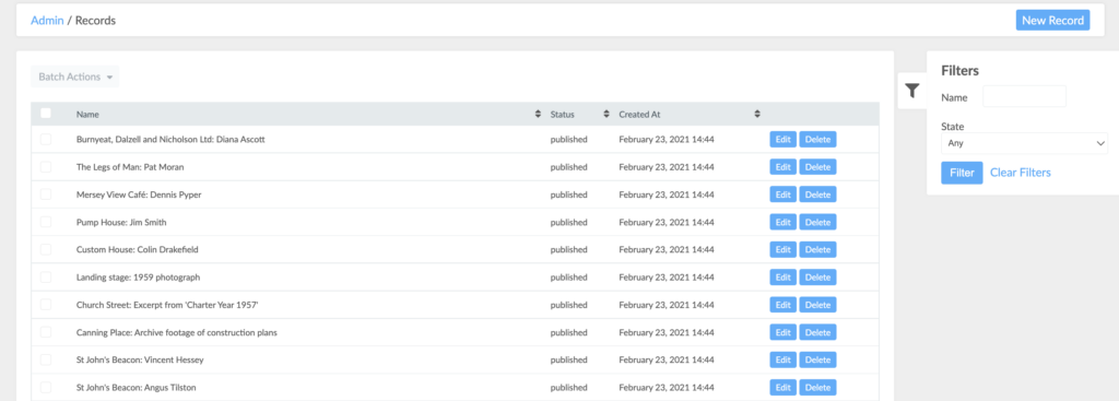
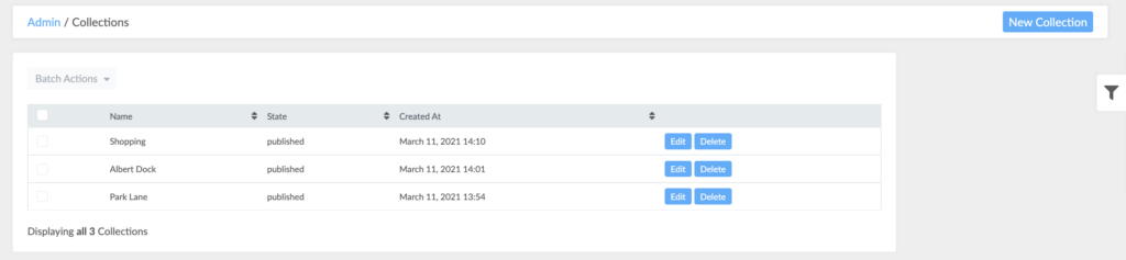
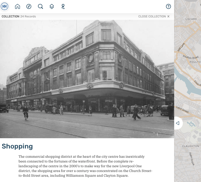
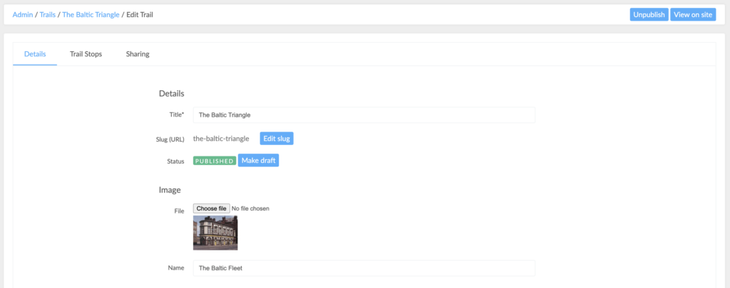
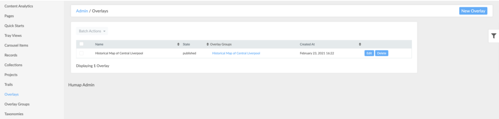
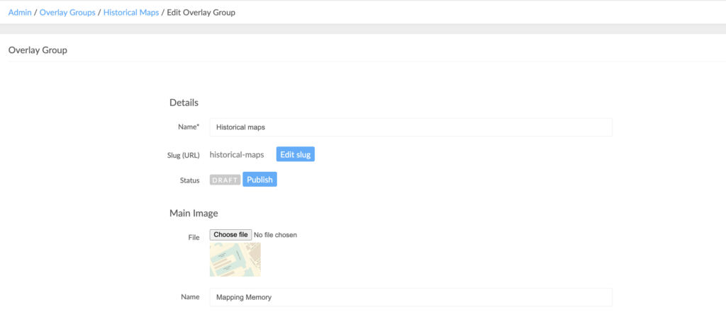
This takes you to the home screen of Humap’s content management system:

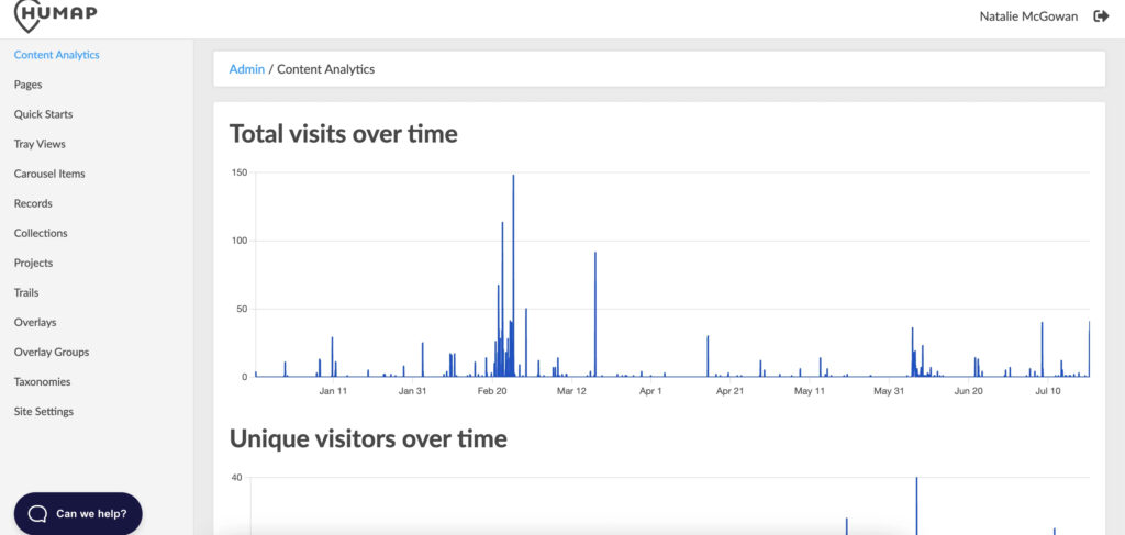
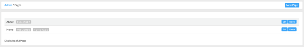
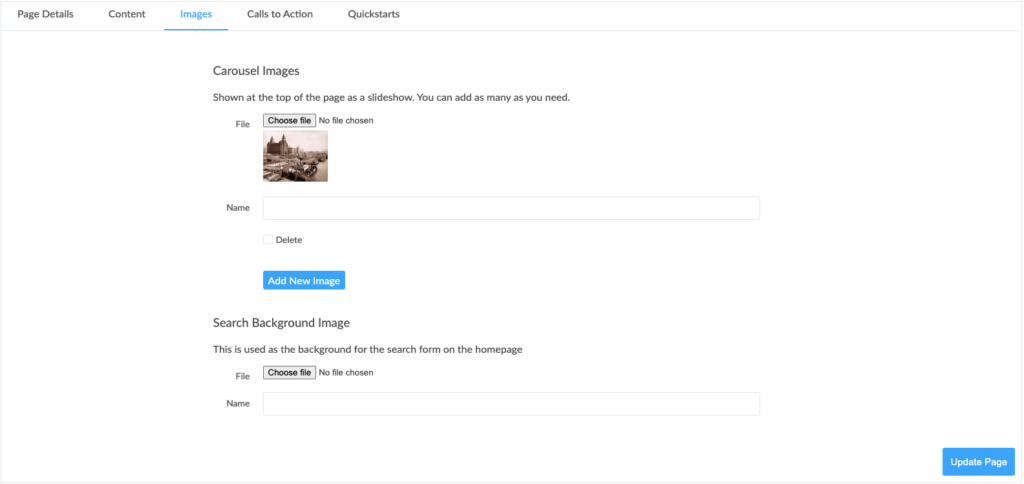
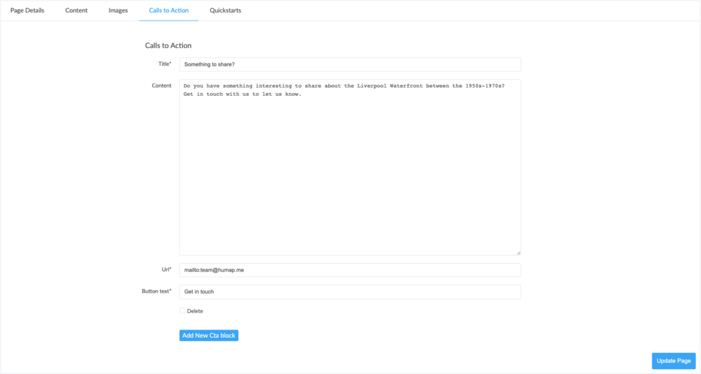
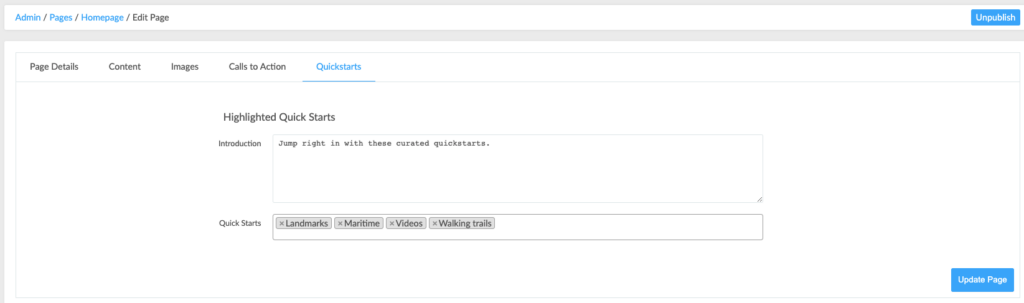
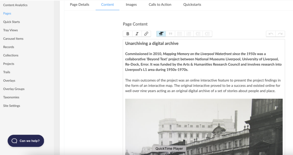
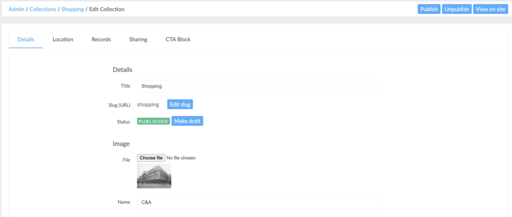
The pages that make up the content management system are listed on the left.

Site settings

This tutorial is available in video and text/image.

The Site Settings tab is where you can supply all of the details needed to keep your instance running. It looks like this:

A screenshot of the site settings/general settings page in the admin dashboard

Here’s how to fill it out:

  • Add a name into the Site Title text box. Don’t worry; you can come back and change this later.
  • Copy and paste a URL into the Website text box. This can link to your Humap instance, a project page, or an institutional webpage.
  • Add an email into the Contact Email box.
  • Write a short description of your sites purpose in the Short Site Description Box. 
  • When you’re done, click Field Settings in the dashboard.

A screenshot of the field settings/general settings page in the admin dashboard

  • Do you want/need at least a start date for every record? Click the ‘yes’ tickbox if so.

A screenshot of the site settings/starting point and zoom page in the admin dashboard

Where would you like your map to centre on? Here’s how the map Starting Point works:

  • Use either the map search box or the latitude/longitude boxes to decide where your map will centre on.
  • Click on the map to drop the red pin. Click somewhere else to move it
  • What level of zoom do you want your map to be on? If your map is specific to a small area of one city, higher zoom is better.
  • To change the zoom, edit the number in the Zoom search box. Higher numbers zoom in more, lower zoom out more (this might require some trial and effort to get right!).

A screenshot of the site settings/social media and footer page in the admin dashboard

Here is how to edit the footer:

  • If your organisation/project has social media, copy and paste the links into the Twitter/Facebook/Instagram fields.
  • You can then add logos by clicking Add New Logo, give them names, and decide their size.

A screenshot of the site settings/social media and footer page in the admin dashboard

This information will appear at the bottom of the home and about webpages.

Pages

This tutorial is available in video and text/image.

While the map is the centrepiece of your instance, Humap comes with a Pages feature that lets you build pages around your map.

There are two types of pages on Humap: Home and Content.

Here is an example of a home page, and here is an example of a content page.

To get to the pages dashboard, click Pages in the menu on the left of the CMS.

Here is the pages dashboard:

A screenshot of the pages dashboard within the admin dashboard

Here is how to create your homepage:

  • Click New Page.

A screenshot of the pages/ page detail section in the admin dashboard

  • Name the homepage in the Title text box.
  • This will generate a slug (URL). If you do not like the URL, click Edit Slug to change it.
  • Click Page Type. This will give you the option of a content page or a homepage. Click Home Page. 
  • Type a description into the Description text box.
  • Where would you like the page location to be? Click the Page Location dropdown menu and pick either Header or Footer. 
  • If you would like a carousel on your homepage, click ‘yes’ on the multiple choice question.
  • Click Content in the dashboard when you’re ready to move on.

A screenshot of the pages/ page content section in the admin dashboard

  • Use the text box to describe your project. Use the formatting options to make the text pop, and the hyperlink function to link to places on the map or on the web.

A screenshot of the pages/images section in the admin dashboard

  • On the Images page, use the Choose File button to upload images to the homepage.
  • Give the image a name in the text box below.
  • You can add as many images as you like.
  • You can also add a Search Background Image by repeating this process.

A screenshot of the pages/call to action section in the admin dashboard

  • Calls to action direct your audience and make it easy for them to get involved. Add a title in the Title Search Box and add a description into the Content Text Box.
  • Copy and paste a URL into the URL Text Box.
  • Name the CTA button in the Button Text Box.

A screenshot of the pages/quick start section in the admin dashboard

Quick starts aren’t compulsory, but they’re useful. Before you can add quick starts onto your home page, you’ll need to create some on the Quick Start page in the admin dashboard.

Here’s how to add them to your home page:

  • Type a short description into the Introduction text box.
  • Click the Quick Starts text box to generate a list of available quick starts. Click the ones you would like to link out to.

When your home page is finished click Create Page and then Publish. You can unpublish and edit the page at any time.

Here is how a finished homepage could look:

This image and the next two are screenshots of the Mapping Memory home page

You can also click here to see Mapping Memory in action!


The second type of page is a Content Page. These are usually pages about the project, or pages that link to other resources on the web. Here’s how to make one:

A screenshot of the pages section in the admin dashboard

  • Go the pages screen on the admin dashboard and click New Page.

A screenshot of the pages/ page detail section in the admin dashboard. 'Content page' is selected this time

  • Name the homepage in the Title text box.
  • This will generate a slug (URL). If you do not like the URL, click Edit Slug to change it.
  • Click Page Type. This will give you the option of a content page or a homepage. Click Content Page. 
  • Type a description into the Description text box.
  • Where would you like the page location to be? Click the Page Location dropdown menu and pick either Header or Footer. 
  • If you would like a carousel on your homepage, click ‘yes’ on the multiple choice question. Carousels are created on the Carousel Item page of the admin dashboard.
  • Click Content in the dashboard when you’re ready to move on.

A screenshot of the pages/ content section in the admin dashboard. The content is a short article entitled 'unarchiving a digital archive'

  • Use the text box to describe your project. Use the formatting options to make the text pop, and the hyperlink function to link to places on the map or on the web.

A screenshot of the pages/ images section in the admin dashboard.

  • On the Images page, use the Choose File button to upload images to the homepage.
  • Give the image a name in the text box below.

A screenshot of the pages/CTA section in the admin dashboard.

  • Calls to action direct your audience and make it easy for them to get involved. Add a title in the Title Search Box and add a description into the Content Text Box.
  • Copy and paste a URL into the URL Text Box.
  • Name the CTA button in the Button Text Box.


A screenshot of the pages/Quickstart section in the admin dashboard.

Quick starts aren’t compulsory, but they’re useful. Before you can add quick starts onto your home page, you’ll need to create some on the Quick Start page in the admin dashboard.

Here’s how to add them to your home page:

  • Type a short description into the Introduction text box.
  • Click the Quick Starts text box to generate a list of available quick starts. Click the ones you would like to link to.

When your home page is finished click Create Page and then Publish. You can unpublish and edit the page at any time.

Here is how a finished content page could look:

This image and the next are screenshots of the About page on Mapping Memory, an example of a content page

Or you can check out Mapping Memory’s About page here.

Quick Starts

This tutorial is available in video and text/image.

Quick Starts link your users to specific places. These can be on your Humap instance or on the web, and are most often used to link to collections or taxonomies.

To see how they look in use, scroll down to the ‘explore by theme’ section of this page.

Here is the quick start dashboard:

A screenshot of a list of Quickstarts in the admin dashboard

Here’s how to make quick starts:

  • Click New Quick Start.

A screenshot of the quick start details dashboard

  • Type a name for your quick start into the Title Text Box and add some content in the Content Text Box.

A screenshot of the Quick start image uploading screen

  • You can then copy and paste a URL in to the URL Text Box and add an image by clicking Choose File and uploading an image.
  • You can also add an image name below.

This is how they look to your users once made visible from the Tray View screen:

A screenshot of how quick starts look on the map

Carousel Items

This tutorial is available in video and text/image.

Carousel Items appear on the homepages and content pages. These usually contain an image on the left and some descriptive text and a button on the right.

Scroll down to the bottom of this page to see Carousel Items in action.

Here’s how to create carousel items:

A screenshot of the New Carousel Item creation screen in the admin dashboard.

  • Go to the admin dashboard and click Carousel Items. This will take you to the Carousel dashboard screen.
  • Name the homepage in the Title text box.
  • Type a description into the Description text box.
  • If relevant, add in a URL, button text, and pick an icon by clicking on the drop down menu.
  • Click Choose File to upload an image.
  • Name the image in the tex box below.
  • Click Create Carousel Item.


Taxonomies and Taxonomy Terms

This video is available in both video and text/image format.

Taxonomies and taxonomy terms are how content on Humap is organised

The taxonomy is the overarching similarity and the taxonomy terms are the smaller subcategories. In this example, the Taxonomy is content type and the Taxonomy Terms are video/image/text.

They can also be displayed on search pages, like this one.

This is the taxonomy dashboard. Here you can edit and delete existing taxonomies and create new ones.

A screenshot of the taxonomy dashboard

  • Click New Taxonomy to create a new one.

A screenshot of the new taxonomy / details screen in the admin dashboard.

  • Name your taxonomy and give it a short description in the box below.
  • If you would like it to appear on the search bar, click the selection box.
  • If it is a legacy taxonomy and you don’t want it to be edited or filtered, click the selection box.
  • Click Create Taxonomy when you are finished.
  • Return to the Taxonomy Dashboard and click View Taxonomy Terms. 
  • The taxonomy terms dashboard looks like this:

A screenshot of the taxonomy terms dashboard

From this dashboard you can edit or delete existing taxonomy terms and create new ones.

Here’s how to create new taxonomy terms:

  • Click New Taxonomy Term. 

A screenshot of the taxonomy terms / new taxonomy screen in the admin dashboard.

  • Add a name into the Name Text Box. 
  • Use the drop down menu below to pick which taxonomy this term belongs too.
  • Click Create New Taxonomy Term. 

Done! You now have taxonomies and taxonomy terms. These will show up on the search page.

Here is how the Mapping Memory search page looks:

A screenshot of Mapping Memory's search page, which lists taxonomies and taxonomy terms

Tray Views

This tutorial is available in both video and text/image format.

Tray Views are different templates for standard pages on your map.

There are two types:  Introduction and Help. You can only have one of each.

Here is the tray view dashboard:

A screenshot of the tray dashboard

Click New Tray View to create a tray.

Introductory Tray View

The introductory page is your map’s home screen, the first thing your visitors will see when they explore the map. This is where you’ll write your introduction to your map, highlight taxonomies, records, and quick starts. 

This is how it looks in the dashboard:

A screenshot of the tray view/introduction/content section in the admin dashboard.

  • Type the title into the Title Text Box and the content in the box below.

Here’s how to create highlighted taxonomy terms:

  • Give your highlighted taxonomy term a title and description by typing in the text boxes.
  • Pick the taxonomy term from the available listed one below. These are listed next to their overarching taxonomy.

A screenshot of the tray view/introduction/content highlighted record section in the admin dashboard.

Here’s how to highlight records and quick starts:

  • Name your highlighted records in the Highlighted Records Title text box
  • Click the Records text box below. This will create a drop down menu which will then display available records.
  • Click the records you would like to highlight.
  • Repeat this process with the quick start options.

Here is how a completed introductory tray view looks on the map:

A screenshot of the Mapping Memory introductory Tray View

Help Tray View

The help page is a handy, in-map repository of useful tips and information.

Here is how it looks in the dashboard:

A screenshot of the tray view/help/content section in the admin dashboard.

  • Type the title into the Title Text Box and the content in the box below.

Here is how this page looks on the map:

A screenshot of Mapping Memory's guide/help page

Content analytics

This tutorial is available in video and image/text.

This is your Analytics Dashboard. Here you can find out:

  • How many people are visiting your instance
  • How many of them are unique
  • Your most viewed content

You can then use this information to report on your instance’s success and optimise your content strategy.

Records

This tutorial is available in video and text/image.

Most of the content on Humap comes in the form of records. Here are some examples of records.

Records can contain text, video, audio, and IIIF rich media.

Records can also be organised into collections, trails, routes, and timelines.

This is how the Records Dashboard looks:

A screenshot of the records section of the admin dashboard

Here’s how to create a new record:

  • Click New Record.
  • You can save and exit this process at any time, and your record won’t be added to the map until you press Publish. You can also edit or Unpublish the record at any time.

A screenshot of Records / Basic content on the admin dashboard

  • Add your record title into the Title text box. The slug (URL) will auto-generated based on your title.
  • If you aren’t happy with the slug, click Edit Slug and then type in the Slug Text Box to continue.
  • Does your record have dates? If so, you can write them in the Date From (start date) and Date To (end date). You can also click the calendar icon at the end of the text box to select a date from there.
  • You can also decide how precisely the date is displayed by ticking the box next to your preferred format.

Another screenshot of Records / Basic content on the admin dashboard

  • The Content text box will be the body of your record. Use the formatting options in the toolbar to make your text pop, and remember to use frequent paragraph breaks!
  • The Excerpt will show on the preview of your record, so it’s best to sum up your record with something that will make other people click on it.
  • When you’re finished on this screen, scroll back up and click Attachments in the top record toolbar.

A screenshot of Records / Attachments on the admin dashboard

  • This is where you add media to your record. Humap supports text, links, videos, images, and rich IIIF media.
  • To upload an image, click Add New Image, select the image, and click upload. Do the same for the other types of media if necessary.
  • When you’re finished, click Attachment Sort Order in the record toolbar.

A screenshot of Records / Attachment Sort Order on the admin dashboard

  • This is where you organise your record’s attachments. The piece of media at the top will be used for the preview image, so choose wisely!
  • When you’re done, click Location in the record toolbar.

A screenshot of Records / Location on the admin dashboard

  • Your record needs a location. You can use the text box in the map to search (via postcode or place name) or use latitude and longitude.
  • When you’ve found the location, click the map to drop the red pin. A record can only have one location, but if you change your mind you can come back and move it.
  • When you’re happy with the location, click Categories.

A screenshot of Records / Categories on the admin dashboard

  • This page lists the Taxonomies defined on your Humap instance (which is why we recommend doing them first!)
  • Click the boxes that are relevant to your record.
  • When you’re done, click Sharing in the record toolbar.


A screenshot of Records / Sharing on the admin dashboard

  • On this page you can create a permalink and a QR code for your record. This feature is extremely optional, but is great for linking your map into real-world spaces.
  • Clicking Create Permalink will create this:

A screenshot of Records / Sharing on the admin dashboard, with a QR code generated

  • When you’re done with the Sharing tab, click CTA block in the record toolbar.

A screenshot of Records / CTA block on the admin dashboard

  • CTA (Call to Action) is used for getting reactions from your users. To create one, you need a title, description, button text, and a URL for the button to send the user too.
  • Your record is now finished! Click Create Record to make a draft, and then Publish to make it visible on a map.

If you have the associated overlay group feature turned on, this button will appear in the menu:

A screenshot showing the 'associate overlay group' screen in the content management system

If you would like an overlay group to be associated with this record, click the drop down menu.

A screenshot showing the 'associate overlay group' screen in the content management system

You can then select which overlay group you would like to be associated with this record.

Click Create Record or Update Record.

This is how a finished record will look:

This image and the next are screenshots of a finished record

Or click here to view this particular record in situ!

Collections

Collections are records grouped together along a common theme. Here are some examples of collections.

This is the Collections Dashboard:

A screenshot of the Collections section of the admin dashboard

Here’s how to make collections:

  • Click New Collections
  • You can save and exit this process at any time, and your collection won’t be added to the map until you press Publish. You can also come back and edit the collection.

A screenshot of Collections / Details on the admin dashboard

  • Add a title into the Title Text Box. The slug (URL) will auto-generated based on your title.
  • If you aren’t happy with the slug, click Edit Slug to change it.

A screenshot of Collections / Content on the admin dashboard

  • The Content text box will be the description of your collection’s content. Use the formatting options in the toolbar to make your text pop, and remember to use frequent paragraph breaks!
  • The Excerpt will show on the preview of your collection, so it’s best to sum up your collection with something that will make other people click on it.

A screenshot of Collections / Location on the admin dashboard

  • Your collection needs a location. You can use the text box in the map to search (via postcode or place name) or use latitude and longitude.
  • When you’ve found the location, click the map to drop the red pin. A collection pin has one location, but each record also has its own location too. You can come back and change the location of the collection pin at any point.
  • When you’re happy with the location, click Records.

A screenshot of Collections / Records on the admin dashboard

  • This is where you add records into your collection. Click on the Records Text Box and a drop down menu will appear listing records.
  • Click the ones you wish to add to your collection. Remember, you can come back and edit this at any time.
  • When you’re done, click Sharing in the collection toolbar.

A screenshot of Collections / Sharing on the admin dashboard

  • Would you like a permalink and/or QR code for your collection? If so, click Create Permalink.

A screenshot of Collections / Sharing, with a QR code generated, on the admin dashboard

  • Humap will then generate a permalink and a QR code for this collection.
  • When you’re done on the sharing screen, click CTA block.

A screenshot of Collections / CTA Block on the admin dashboard

  • CTA (Call to Action) is used for getting reactions from your users. To create one, you need a title, description, button text, and a URL for the button to send the user too.

If you have the associated overlay group feature turned on, this button will appear in the menu:

A screenshot showing the 'associate overlay group' screen in the content management system

If you would like an overlay group to be associated with this record, click the drop down menu.

A screenshot showing the 'associate overlay group' screen in the content management system

You can then select which overlay group you would like to be associated with this record.

Click Create Collection or Update Collection.

Your collection is now finished! Here is how finished collections will look:

This image and the next are screenshots of a finished collection

Click here to view this particular collection in situ!

Projects

Projects are spaces for individual teams to work together.

Here’s how to create a new project:

A screenshot of Project creation on the admin dashboard

  • Name the homepage in the Title text box.
  • Type a description into the Content text box.
  • Does your project have an external attribution field, like a record number? Click Add New Attribution Field and add the information in the text box.
  • Type in the information in the Name text box.
  • Click Create Project

Trails

This tutorial is available in video and text/image.

Trails are walkable series of records. Here are some examples of the trails feature in action.

Here is the Trails Dashboard:

A screenshot of trails section on the admin dashboard

Here’s how to create new trails?

  • Click New Trail.

A screenshot of Trails / Details on the admin dashboard

  • You can save and exit this process at any time, and your trail won’t be added to the map until you press Publish. You can also come back and edit the collection.
  • Add a title into the Title Text Box. The slug (URL) will auto-generated based on your title.
  • If you aren’t happy with the slug, click Edit Slug to change it.

A screenshot of Trails / Details on the admin dashboard

  • The Content text box will be the description of your collection’s content. Use the formatting options in the toolbar to make your text pop, and remember to use frequent paragraph breaks!
  • Trail Distance and Trail Duration are important! If you’re not sure, use Google Maps to recreate the route and then use their estimate here.


A screenshot of Trails / Trail Stops on the admin dashboard

  • This is where you will decide what records make up the trail. Click Add New Trail Record.
  • This will create a drop down menu where you can pick a record. Click the record you want to add it into the trail.
  • Use the drag and drop icon (to the left and slightly below) each record to change its place in the trail. The record at the top will be the first, and the record at the bottom will be the last.

A screenshot of Trails / Sharing on the admin dashboard

  • Would you like a permalink and/or QR code for your collection? If so, click Create Permalink.
  • Humap will then generate a permalink and a QR code for this collection.
  • Your trail is now finished! Here is how finished trails look:

This image and the next are screenshots of a finished trail

Click here to see this trail in situ!


Overlays & Overlay Groups

This tutorial is available in video and text/image.

Overlays are geo-rectified historical/antique maps or statistical data, layered on top of the base map.

Here are some examples of overlays.

At present, creating an overlay takes some work from our team. We are provided with a map – these are usually large scale scans. These are then geo-rectified in a program called MapTiler and exported out as tile sets which are hosted on Amazon S3. Creating an overlay & overlay group in the CMS points to these tiles.

From this dashboard you can edit or delete existing overlays and create new ones.

A screenshot of Overlays section on the admin dashboard

How to add new overlays:

  • Click New Overlay.

A screenshot of Overlays / Basic content on the admin dashboard

  • Add a name and a URL for the overlay.
  • Use the Overlay Groups box to tag it with any relevant overlay groups.
  • If you would like to create an overlay group with the same name, click the Yes checkbox next to the question.
  • Use the Overlay Type checkboxes to signify if the overlay uses raster or vector data.
    • Rasters are image files, which are typically scans of historic hand drawn maps. Vectors are mathematical points that represent data on the map and will have associated metadata such as identification number, title, description, taxonomies.
  • When you’re finished on this page, click Date and Location in the overlay toolbar.

A screenshot of Overlays / Date and Location on the admin dashboard

  • Does your overlay have dates? If so, you can write them in the Date From (start date) and Date To (end date). You can also click the calendar icon at the end of the text box to select a date from there.
  • Your overlay pin needs a location. You can use the text box in the map to search (via postcode or place name) or use latitude and longitude.
  • When you’ve found the location, click the map to drop the red pin.
  • When you’re happy with the location, click Categories.

A screenshot of Overlays / Categories on the admin dashboard

  • Tick the appropriate boxes for your overlay.
  • Remember, you can come back and edit this at any point.
  • Your overlay is complete! This is how it will look on the map:

A screenshot of a finished overlay

Click here to see the map in situ!


Overlays can also be grouped along a similar theme or topic.

Here is the overlay group dashboard. Here you can edit and delete existing overlay groups and create new ones.

A screenshot of the Overlay Groups section of the admin dashboard

  • To create a new overlay group, click New Overlay Group.

A screenshot of Overlay Groups / Edit Overlay Group on the admin dashboard

  • Add a title into the Title Text Box. The slug (URL) will auto-generated based on your title.
  • If you aren’t happy with the slug, click Edit Slug to change it.
  • Click Choose File and upload a representative image of your overlay group. Name it in the box below.

A screenshot of Overlay group / content on the admin dashboard

  • The Content text box will be the description of your collection’s content. Use the formatting options in the toolbar to make your text pop, and remember to use frequent paragraph breaks!
  • The Excerpt will show on the preview of your collection, so it’s best to sum up your collection with something that will make other people click on it.
  • click the Overlays text box beneath the Excerpt box. This will create a drop down menu with a list of available overlays.
  • Click the overlays relevant to this list.
  • Done!

Send a message

How can we help?

We usually respond in a few hours